


[Infographic] NPR Shows You 100 Years of Immigration in Two Graphs
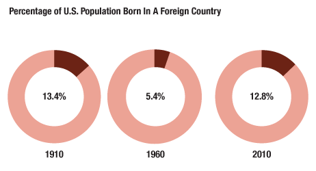
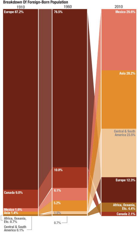
NPR's LAM THUY VO has designed two great infographics chronicling the last 100 years of immigration to the United States. Two main points, immigrants make up less of the population than they did at the beginning of the 20th century, and more recent immigrants are coming from different countries.
via NPR
###
Do you like this post?


Showing 1 reaction
Sign in with