


The Exploding Student Loan Debt Chart
 Mounting student debt in this economy is not only rising but an Occupy Wall-Street-affiliated chart that has been floating around in cyberspace doesn’t accurately portray this rising debt among the nation’s youth.
Via Yahoo! News
This Occupy Wall Street-affiliated chart, at right, flew around Facebook and Twitter this week as hundreds of people used it to share their frustrations about ballooning student debt in America. It’s also inspired blog posts at Jezebel and Buzzfeed, among other sites.
But as far as we can tell, the chart is just plain wrong. Mark Kantrowitz, the publisher of FinAid.org, a student loan advice site concerned with rising educational debt, tells Yahoo News that total student debt has increased five-fold between 2000 and 2011, (not counting inflation) and is nearing $1 trillion. This chart shows a much larger increase, with student debt increasing by a factor of 25 over the same period.
A Federal Reserve Bank of New York report earlier this year showed a six-fold increase in student loans, but the group has since rescinded the paper due to errors. The Occupy chart cites the Federal Reserve Bank of St. Louis as its source, but a spokesman from the Bank told Yahoo News he wasn’t sure what report or dataset it could be referring to. It’s possible that the chart is referring to something other than the total amount of outstanding student loans during each of these years, but if it is, then it’s very misleading. (Please email me if you have a theory about what data the chart is using.)
Kantrowitz says he thinks whoever made the chart may have accidentally “set the diameters of the circles in proportion to the ratio, instead of the area of the circles in proportion. If they had done it correctly, the 2000 circle should have been about half the height of the 2011 circle.”
Mother Jones magazine created just such a chart in September, using data that estimated student loans had quintupled between 2000 and 2011:
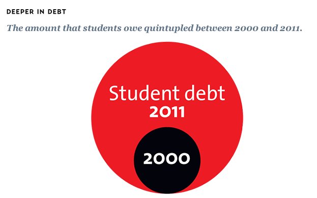
Student debt (Mother Jones)
It's true that student debt has risen sharply over a very short period, driven by rising tuition costs. College tuition has grown much faster than average wages over the past three decades, with average public university tuition tripling since 1980. Total outstanding student loan debt surpassed credit card debt for the first time in 2010.
But Sandy Baum, policy analyst for the College Board, tells Yahoo News that this comparison is "meaningless" in understanding the debt increase because more people are going to college. According to the National Center for Education Statistics, enrollment in postsecondary institutions increased 38 percent between 1999 and 2009, from 14.8 million to 20.4 million. Black and Hispanic students--who are more likely to be low-income than white students and thus tend to take out loans at a higher rate--made up a greater share of college and post-grad students in 2009 than ever before.
The average debt each student carries upon graduation--a more accurate measure of how burdensome student loan debt is--has increased by more than 50 percent between 2000 and 2011, Kantrowitz says. Carrying that debt becomes scarier in a down labor market, where college graduates are faring much better than their less-educated peers but are still facing higher jobless rates than they would have 10 years ago.
The Occupy Student Debt Campaign wants the federal government to forgive all student loans, and are asking protesters to sign a "Pledge of Refusal." Once a million people sign on, the occupiers will stop paying their loans. So far, 2,500 have signed.
Update: Thinkprogress has created a corrected version of the chart here.


Showing 1 reaction
Sign in with